데이터 시각화를 위한 방법은 정말 다양해서 다 외우기는 힘들지만,
응용을 위해서 기본 개념을 정리해보려 합니다.
👀 matplotlib 호출
import matplotlib.pyplot as plt
1. fig, ax
fig = plt.figure(figsize=(넓이, 높이)) => 그래프를 그릴 하얀색 판을 어떤 넓이, 높이로 그려라
ax = plt.axes() => fig로 그린 판 위에 그래프를 그리기 위한 기본 객체
Fig와 Ax를 한번에 지정
=> fig, ax = plt.subplots()
여기서 하나의 판(figure)에 여러 axes 생성이 가능한데, 위치 호출을 통해 각 plot을 조율할 수 있습니다.
fig, ax = plt.subplots(2,2) ==> 2행 2열 행태로 그래프를 그리겠다
| ax[0][0] | ax[0][1] |
| ax[1][0] | ax[1][1] |
만약에 처음부터 plt.subplots(2,2)가 귀찮다면 figure로 도화지를 그리고
add_plot을 이용해서 서로 다른 위치에 subplot을 만들 수도 있습니다.
fig, axs = plt.subplots(2, 2)
axs[0, 0].plot(x, y)
axs[0, 1].plot(x, y+1,)
axs[1, 0].plot(x, -y, )
axs[1, 1].plot(-x, y)
**여기서 만약, plt.plot을 사용하면 plot가 가장 최근 값인 ax2로 자동으로 인식하기 때문에 1행 2열의 2열에 2가지 선이 모두 그려지게 됩니다. ax1.plot과 ax2.plot은 위치를 좀 더 명시적으로 알려주는 방법이라고 생각합니다. 만약 plt.plot을 쓰게 되면 아래처럼 ax1을 명시하고 -> 그 그래프를 받은 plot을 그리고, ax2를 명시하고 -> 그래프를 그리고 plt의 대상을 구분해주어야 합니다.
ax1 = fig.add_subplot(1,2,1) -> 1행 2열에 1열에 넣겠다
plt.plot([값])
ax2 = fig.add_subplot(1,2,2) -> 1행 2열에 2열에 넣겠다
plt.plot([값])
Figure구성의 기본 요소
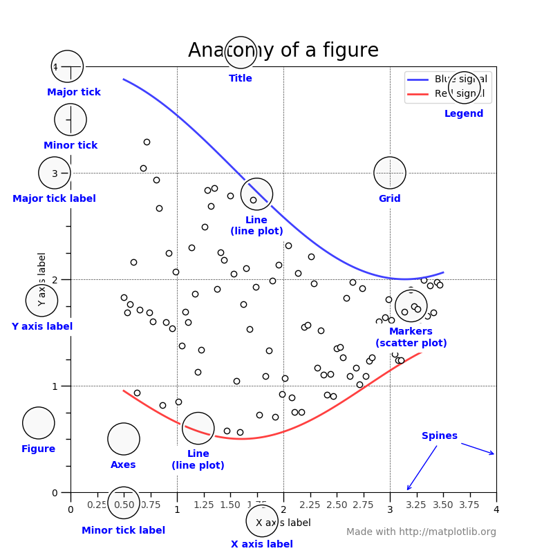
figure에서는 이 그림에 표현된 이름을 가지고 그래프의 모양을 바꿀 수 있습니다.
예시)
plt.ylabel("y axis")
plt.legend()
plt.xticks(np.arange(5,step=1))
plt.axis([xmin,xmax,ymin,ymax]) -> x축과 y의 범위를 지정
plt.grid(True)
plt.title("Graph1")
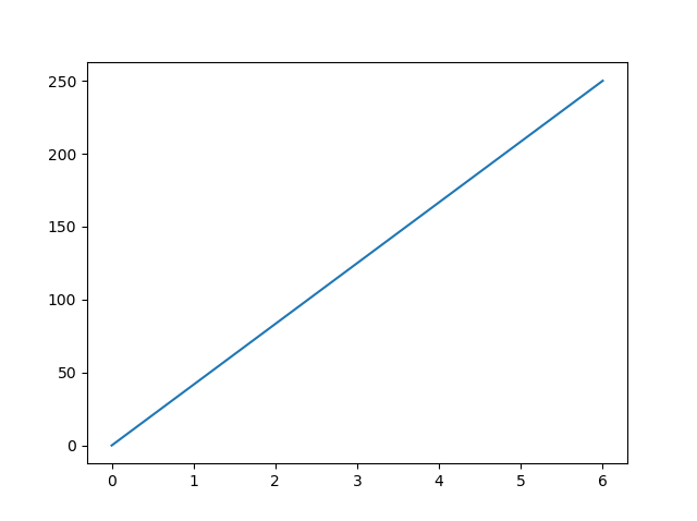
2. 선 그래프 그리기
matplotlib.pyplot.plot(x값, y값)
일반적으로 함수를 그릴 때 x,y값이 필요한 것처럼 그래프를 그릴 때도 값을 알려줘야 합니다.
수동으로 그릴때는 plt.plot([1,2,3],[2,4,5]) 이런 식으로 할 수 있지만 일반적으로 데이터 분석시에는
plt.plot('컬럼명','컬럼명') 이런 식으로 하나의 피처 자체를 호출하는 것 같습니다
물론 그래프를 그리는 방법에도 색깔을 바꾸고, 선의 모양을 바꾸고 등등 옵션을 지정할 수 있겠죠?
plt.plot(x, y, 'go--', linewidth=2, markersize=12)
plt.plot(x, y, color='green', marker='o', linestyle='dashed',
     linewidth=2, markersize=12)
(Source: matplotlib.org)
여기서 marker는 각 데이터 포인트마다 어떤 모양으로 점을 찍을건지를 의미합니다. 일반적으로 'o'는 원형 마커를 의미합니다. 여기서 만약 'bo'를 하면 blue + o marker이기 때문에 파란색 원형 마커가 그려지게됩니다.
[ matplotlib 마커 종류 (source: matplotlib.org) ]
| "." | point | |
| "," | pixel | |
| "o" | circle | |
| "v" | triangle_down | |
| "^" | triangle_up | |
| "<" | triangle_left | |
| ">" | triangle_right | |
| "1" | tri_down | |
| "2" | tri_up | |
| "3" | tri_left | |
| "4" | tri_right | |
| "8" | octagon | |
| "s" | square | |
| "p" | pentagon | |
| "P" | plus (filled) | |
| "*" | star | |
| "h" | hexagon1 | |
| "H" | hexagon2 | |
| "+" | plus | |
| "x" | x | |
| "X" | x (filled) | |
| "D" | diamond | |
| "d" | thin_diamond | |
| "|" | vline | |
| "_" | hline | |
| 0 (TICKLEFT) | tickleft | |
| 1 (TICKRIGHT) | tickright | |
| 2 (TICKUP) | tickup | |
| 3 (TICKDOWN) | tickdown | |
| 4 (CARETLEFT) | caretleft | |
| 5 (CARETRIGHT) | caretright | |
| 6 (CARETUP) | caretup | |
| 7 (CARETDOWN) | caretdown | |
| 8 (CARETLEFTBASE) | caretleft (centered at base) | |
| 9 (CARETRIGHTBASE) | caretright (centered at base) | |
| 10 (CARETUPBASE) | caretup (centered at base) | |
| 11 (CARETDOWNBASE) | caretdown (centered at base) | |
| "none" or "None" | nothing | |
| " " or "" | nothing | |
| '$...$' | Render the string using mathtext. E.g "$f$" for marker showing the letter f. | |
| verts | A list of (x, y) pairs used for Path vertices. The center of the marker is located at (0, 0) and the size is normalized, such that the created path is encapsulated inside the unit cell. |
이런식으로 옵션 설정이 가능한데 자세한 옵션은 아래 문서를 참고 바랍니다
https://matplotlib.org/stable/api/_as_gen/matplotlib.pyplot.plot.html
matplotlib.pyplot.plot — Matplotlib 3.6.0 documentation
An object with labelled data. If given, provide the label names to plot in x and y. Note Technically there's a slight ambiguity in calls where the second label is a valid fmt. plot('n', 'o', data=obj) could be plt(x, y) or plt(y, fmt). In such cases, the f
matplotlib.org
matplotlib 색 종류
사용가능한 색 팔레트의 종류는 정말 다양한데요 아래처럼 단색부터 번지는 색깔, 색깔 파라다임 등등 취향에 맞게 사용할 수 있습니다
단색 종류 색)
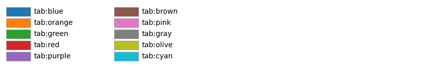

https://matplotlib.org/stable/gallery/color/named_colors.html
List of named colors — Matplotlib 3.6.0 documentation
Note Click here to download the full example code List of named colors This plots a list of the named colors supported in matplotlib. For more information on colors in matplotlib see Helper Function for Plotting First we define a helper function for making
matplotlib.org
Colormap 종류)

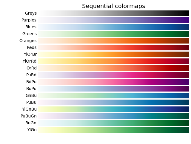
https://matplotlib.org/stable/tutorials/colors/colormaps.html
선 그래프에서 구간 채우기
matplotlib.pyplot.fill_between
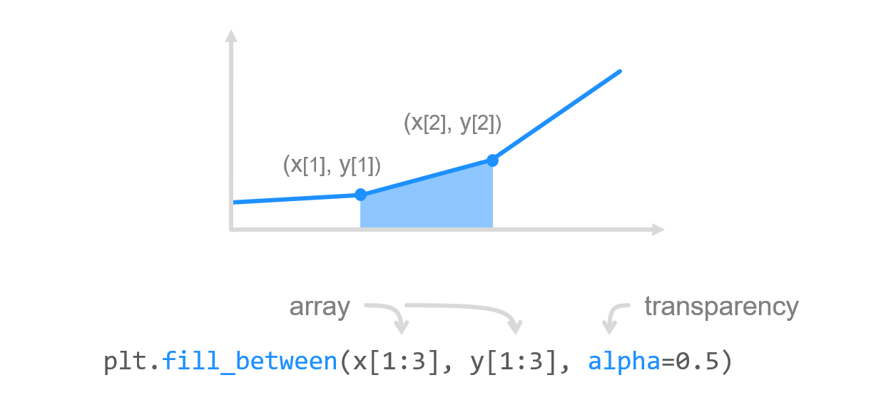
이런식으로 수동으로 구간을 지정해줄 수도 있고
혹은 where 조건 혹은 어떤 y값 과 다른 y값 사이 정도로 지정할 수도 있습니다
# Filling between line a3
# and line a4
plt.fill_between(x, a3, a4, color='green',
                 alpha=0.5)
plt.show()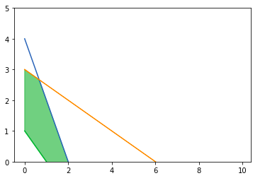
plt.fill_between(a, b, 0,
                 where = (a > 2) & (a <= 3),
                 color = 'g')
plt.plot(a,b)
2개 이상의 선그래프 한번에 그리는 법
plt.plot(x값1,y값1,스타일,x값2,y값2,스타일...)
이런식으로 첫번째 곡선의 x값, y값 , 스타일(색,마커 등등)을 나열하면 한번에 여러 곡선의 그래프를 그릴 수 있습니다.
예시)
plt.plot(x,x-2,color='b',x+2,x**2,marker='*')
3. 막대 그래프 그리기
선 그래프가 plt.plot이었다면 막대그래프는 plt.bar() !!
활용법도 앞선 그래프와 큰 차이가 없어서 쉽게 응용해볼 수 있는데요
matplotlib.pyplot.bar(x, height, width=0.8, bottom=None, *, align='center', data=None, **kwargs)'
보유한 변수들을 알아보면 height 는 높이, width는 막대의 넓이, aligh은 x tick을 기준으로 막대가 어디에 위치해야 되는지 인데요. align = 'center'이면 xtick과 막대가 중앙정렬의 형태로 오고, 'edge'의 경우에는 x tick의 오른쪽 끝쪽에 막대가 오게 됩니다.
plt.bar에서도 color, linewidth 등 옵션 설정이 가능하며, 만약 여기서 log=True를 하게 되면 y축이 log 스케일로 표시됩니다
누적 막대 그래프 그리기 (stacked bar)
그렇다면 막대를 누적해서 전체적인 비율을 볼려면 어떻게 해야 할까요? 방법은 비교적 간단합니다!
2개의 그래프를 호출하고 어떤 값이 누적 막대그래프의 bootom(밑)에 위치하는지 명시해주면 됩니다

import matplotlib.pyplot as plt


labels = ['G1', 'G2', 'G3', 'G4', 'G5']
men_means = [20, 35, 30, 35, 27]
women_means = [25, 32, 34, 20, 25]
width = 0.35       # the width of the bars: can also be len(x) sequence

fig, ax = plt.subplots()

ax.bar(labels, men_means, width,label='Men')
ax.bar(labels, women_means, width, bottom=men_means,label='Women')
#bottom에 men_means가 온다고 명시

ax.set_ylabel('Scores')
ax.set_title('Scores by group and gender')
ax.legend()

plt.show()
가로방향 막대 그래프 그리기
여기서 만약 누워있는 가로형태의 그래프를 그리고 싶다면 bar +h => barh를 사용해주면 됩니다.
plt.barh(x,y,height=1,align='center',color='m',edgecolor='gray')
대략 이런식으로 기존 plt.bar을 사용하는 방식에서 barh로 바꿔주기만 하면 됩니다!
matplotlib 홈페이지에서 재밌는 코드를 발견해서 가지고 왔는데요. 만약 어떤 설문조사를 했고 문항별 응답 비율을 보고 싶다면 아래와 같은 가로형 막대 그래프로 표현이 가능합니다
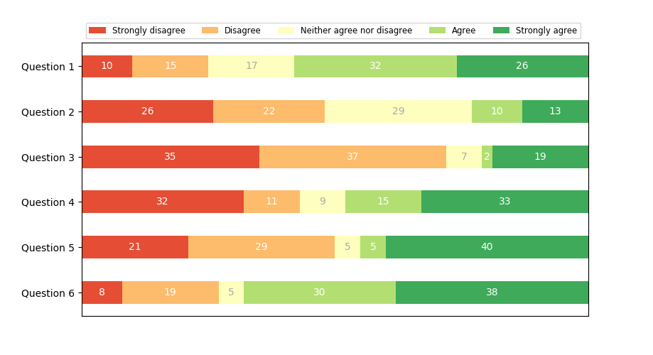
import numpy as np
import matplotlib.pyplot as plt


category_names = ['Strongly disagree', 'Disagree',
                  'Neither agree nor disagree', 'Agree', 'Strongly agree']
results = {
    'Question 1': [10, 15, 17, 32, 26],
    'Question 2': [26, 22, 29, 10, 13],
    'Question 3': [35, 37, 7, 2, 19],
    'Question 4': [32, 11, 9, 15, 33],
    'Question 5': [21, 29, 5, 5, 40],
    'Question 6': [8, 19, 5, 30, 38]
}


def survey(results, category_names):
    labels = list(results.keys())
    data = np.array(list(results.values()))
    data_cum = data.cumsum(axis=1)
    category_colors = plt.get_cmap('RdYlGn')(
        np.linspace(0.15, 0.85, data.shape[1]))

    fig, ax = plt.subplots(figsize=(9.2, 5))
    ax.invert_yaxis()
    ax.xaxis.set_visible(False)
    ax.set_xlim(0, np.sum(data, axis=1).max())

    for i, (colname, color) in enumerate(zip(category_names, category_colors)):
        widths = data[:, i]
        starts = data_cum[:, i] - widths
        ax.barh(labels, widths, left=starts, height=0.5,
                label=colname, color=color)
        xcenters = starts + widths / 2

        r, g, b, _ = color
        text_color = 'white' if r * g * b < 0.5 else 'darkgrey'
        for y, (x, c) in enumerate(zip(xcenters, widths)):
            ax.text(x, y, str(int(c)), ha='center', va='center',
                    color=text_color)
    ax.legend(ncol=len(category_names), bbox_to_anchor=(0, 1),
              loc='lower left', fontsize='small')

    return fig, ax


survey(results, category_names)
plt.show()
이 코드는 따로 bottom을 지정하기 보다는 width와 starts를 지정해서 차곡차곡 우측으로 값이 쌓이도록 했습니다.
산점도 그래프 그리기 (plt.scatter)
산점도 그래프를 사용하기 위해서는 bar이 아닌 흩어뿌린다는 영어 의미인 plt.scatter을 사용해야 합니다.
선이나 막대 그래프와 산점도 그래프의 가장 큰 차이는 점의 크기입니다
plt.scatter(x,y,s=markersize,c = color,marker ='o',cmap=colormap...) 여러 옵션이 있는데요
여기서 c는 색깔 color, s 가 바로 마커 사이즈를 의미하며 보통 포인터의 **2 제곱 값을 사용합니다.
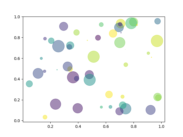
import numpy as np
import matplotlib.pyplot as plt

# Fixing random state for reproducibility
np.random.seed(19680801)


N = 50
x = np.random.rand(N)
y = np.random.rand(N)
colors = np.random.rand(N)
area = (30 * np.random.rand(N))**2  # 0 to 15 point radii

plt.scatter(x, y, s=area, c=colors, alpha=0.5)
plt.show()

(Source:matplotlib.org)
파이 차트 그리기 (plt.pie)
원형 그래프를 그리려면 plt.pie를 사용하면 되는데요
원이기 때문에 옵션이 기존과 다른 점이 몇가지 있어서 짚고 넘어가겠습니다
matplotlib.org 의 예시를 보면서 공부해보겠습니다
import matplotlib.pyplot as plt

# Pie chart, where the slices will be ordered and plotted counter-clockwise:
labels = 'Frogs', 'Hogs', 'Dogs', 'Logs'
sizes = [15, 30, 45, 10]
explode = (0, 0.1, 0, 0)  # only "explode" the 2nd slice (i.e. 'Hogs')

fig1, ax1 = plt.subplots()
ax1.pie(sizes, explode=explode, labels=labels, autopct='%1.1f%%',
        shadow=True, startangle=90)
ax1.axis('equal')  # Equal aspect ratio ensures that pie is drawn as a circle.

plt.show()
여기서 sizes에는 원형에서 각 값이 차지하는 크기, explode는 몇번째 값이 얼마나 기존 파이차트에서 떨어지도록 하겠다
labels는 원형 그래프의 레이불, autopct는 어떤 형식으로 비율을 표시하겠다는 말을 의미합니다.
shadow는 파이 차트의 그림자여부, startangle은 첫번째 조각이 몇도에서 시작을 하겠다는 것을 의미합니다.
추가적으로 counterclock =False를 하면 기존 시계반대 방향순의 표시가 그 반대의 방향으로 표현됨을 의미합니다

히스토그램 그리기 (plt.hist)
matplotlib 의 그래프 이름들은 다 좀 직관적인 편인 것 같은데요. 이번에는 histogram의 앞글자를 딴 plt.hist를 적용합니다
히스토그램은 서로 겹치지 않는 구간(bin)이 각 계급별 도수를 연속되게 나타낸 그래프를 의미하는데요
이 때문에 pyplot (x, bin구간, range,density,weights,cumulative,bottom,histtype,align ...) 등 다양한 옵션이 존재합니다.
bins는 주어진 값의 구간이 얼마나 될 건지를 의미하고 range는 생략시에 자동으로 x의 최소값에서 최대값까지로 설정됩니다. density=True가 y값이 각 구간의 빈도수가 되는게 아니라 (구간의 빈도수)/(전체빈도수)의 확률로 나타내게 됩니다.
import numpy as np
import matplotlib.pyplot as plt

# Fixing random state for reproducibility
np.random.seed(19680801)

mu, sigma = 100, 15
x = mu + sigma * np.random.randn(10000)

# the histogram of the data
n, bins, patches = plt.hist(x, 50, density=True, facecolor='g', alpha=0.75)


plt.xlabel('Smarts')
plt.ylabel('Probability')
plt.title('Histogram of IQ')
plt.text(60, .025, r'$\mu=100,\ \sigma=15$')
plt.xlim(40, 160)
plt.ylim(0, 0.03)
plt.grid(True)
plt.show()
Hexbin plot 그리기 (plt.hexbin)
Hexbin plot은 좀 생소한 그래프의 형태인데요. 기존의 산점도에다가 데이터의 개수에 따라 색상의 농도가 달라져서
데이터가 많은 경우에 산점도에서 그래프가 무더기로 겹쳐 보이는 현상을 보완할 수 있습니다
(Source: Geeksforgeeks)
import matplotlib.pyplot as plt
import numpy as np

np.random.seed(19680801)

n = 100000
x = np.random.standard_normal(n)
y = 12 * np.random.standard_normal(n)

plt.hexbin(x, y, gridsize = 50, cmap ='Greens')
plt.title('matplotlib.pyplot.hexbin() Example')
plt.show()

Box plot (=Whisker plot) 그리기 (plt.boxplot)
Boxplot은 중앙값, 데이터의 분포, 최대, 최소값을 효과적으로 볼 수 있는 그래프입니다.
이 그래프는 가장 중간의 선은 중앙값, 박스의 양 끝값은 Q1,Q3 그리고 선의 양 끝은 최소, 최대 값을 의미합니다
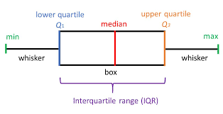
(Source: Geeksforgeeks)
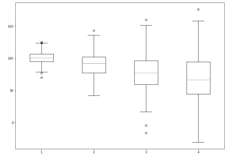
import matplotlib.pyplot as plt
import numpy as np
# Creating dataset
np.random.seed(10)
data_1 = np.random.normal(100, 10, 200)
data_2 = np.random.normal(90, 20, 200)
data_3 = np.random.normal(80, 30, 200)
data_4 = np.random.normal(70, 40, 200)
data = [data_1, data_2, data_3, data_4]
fig = plt.figure(figsize =(10, 7))
# Creating axes instance
ax = fig.add_axes([0, 0, 1, 1])
# Creating plot
bp = ax.boxplot(data)
# show plot
plt.show()
이 코드는 boxplot 뿐만 아니라 데이터를 하나의 리스트로 저장하고 이후에 fig.add_axes를 통해서 axes를 추가하는 방식이 특이해서 가지고 왔습니다. ax = fig.add_axes([0,0,1,1]) 지정을 통해서 [왼쪽, 아래, 가로 넓이, 높이] 를 지정해줬습니다
↓↓ matplotlib 홈페이지 ↓↓
https://matplotlib.org/3.5.1/api/_as_gen/matplotlib.pyplot.html
'Data Science' 카테고리의 다른 글
| ChatGPT 이용 상세 리뷰 😮 (0) | 2022.12.26 |
|---|---|
| 데이터 타입별 컬럼 구분하기 ✔ (0) | 2022.10.12 |
| [ Scikit-learn] Preprocessing.PolynomialFeatures 정리 (0) | 2022.10.01 |
| [Scikit-learn] Impute.SimpleImputer (0) | 2022.09.22 |
| Select_dtypes, mutual_info_classif (0) | 2022.06.21 |

댓글